Seasonal color analysis classifies each client into one of four palettes (Spring, Summer, Autumn, Winter) based on their skin undertone, hair color, and eye color, then matches those characteristics to frame colors that complement rather than compete with their natural coloring. For opticians, applying this method during consultations turns a subjective “which color do you like?” conversation into a structured recommendation backed by color theory. The result: clients leave more confident in their purchase, return fewer frames, and associate the shop with a level of service that online retailers cannot replicate.

What Is Seasonal Color Analysis and Why It Matters for Frame Selection
Seasonal color analysis is a system that evaluates a person’s natural coloring across three dimensions:
- Temperature (warm or cool undertone)
- Depth (light, medium, or dark overall coloring)
- Intensity (vivid/contrasted or muted/soft)
Based on these three factors, each person falls into one of four seasonal palettes: Spring, Summer, Autumn, or Winter. The system originated with Swiss artist and Bauhaus teacher Johannes Itten (1888-1967), who was the first to associate color palettes with four types of people and designate those types with the names of seasons. In his 1961 book The Art of Color, Itten observed that students instinctively gravitated toward colors reflecting their own appearance.
American color consultant Suzanne Caygill expanded Itten’s ideas into a practical framework for personal styling, publishing Color: The Essence of You in 1980 with detailed sub-groupings like “Early Spring” and “Metallic Autumn.” That same year, Carole Jackson’s bestseller Color Me Beautiful brought the four-season system to a mass audience. By 1983, the book was in its 31st printing, and seasonal color analysis had become a standard tool in fashion and beauty consulting.
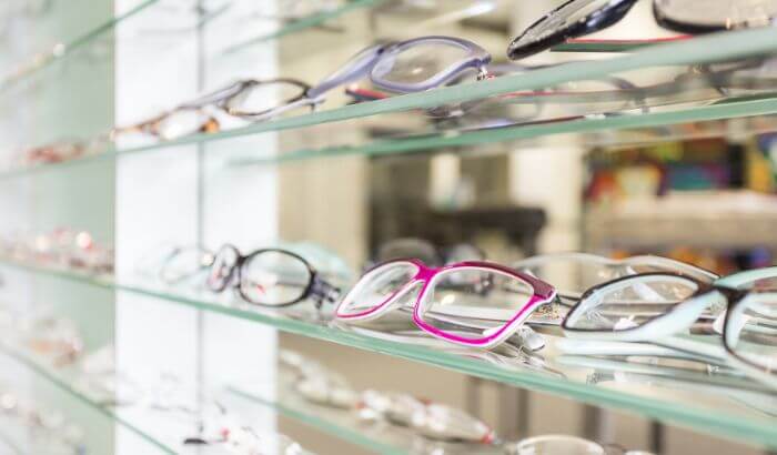
For opticians, the relevance is direct: eyeglass frames are the most prominent accessory on a person’s face. A frame in a clashing color can dull a client’s complexion; the right color brings out their natural features and creates an immediate sense of satisfaction with the purchase. As Chroma Modern Eyewear notes, the foundation for choosing flattering glasses starts with “identifying whether your skin has warm, cool, or neutral undertones and then select frame colors that harmonize well.”
How to Identify a Client’s Skin Undertone in 3 Steps
Determining undertone requires no special equipment. These three checks can be done during a standard frame consultation under natural or neutral-white lighting.
Step 1: The Vein Test Ask the client to look at the inside of their wrist under natural light. According to Zenni Optical’s frame selection guide, “Veins on the inside of the wrist appear green” for warm undertones and “appear blue or purple” for cool undertones. If the veins show a mix of both green and blue-purple, the undertone is neutral.
Step 2: The Metal Test Ask which metal the client prefers against their skin: gold or silver. Gold flatters warm undertones; silver flatters cool undertones. Clients who look equally good in both typically have a neutral undertone. This test reinforces the vein check and takes seconds.
Step 3: Evaluate Depth and Intensity Look at the client’s overall coloring (skin, hair, and eyes together). Are they light or dark? High-contrast (dark hair with light skin) or low-contrast (similar tones throughout)? These observations determine which season within their undertone group applies.
The 4 Seasonal Palettes and Frame Color Recommendations
Spring: Warm Undertone, Light, and Vivid
Spring types have warm, clear, and bright coloring. Skin shows visible golden tones, eyes tend toward light green, hazel, or golden brown, and hair ranges from golden blonde to warm light brown with golden or coppery highlights.
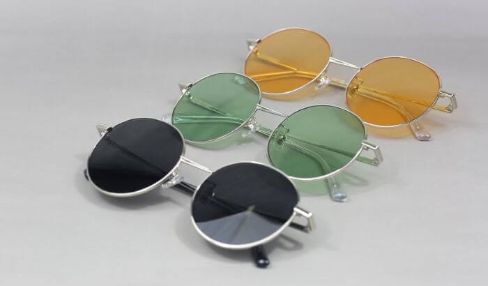
Recommended frame colors: warm and bright tones, including gold, honey, caramel, coral, bright olive, and amber tortoiseshell. Best metals: gold and rose gold. Colors to avoid: gray, silver, pure black, and cool tones like navy or dark burgundy.
Summer: Cool Undertone, Light, and Soft
Summer types have cool, light, and muted coloring. Skin appears pinkish or ashy beige, eyes are blue, gray, or light brown with grayish undertones, and hair is ashy blonde or cool light brown without golden highlights.
Recommended frame colors: cool and soft tones, including gray, lavender, powder blue, dusty rose, matte silver, lilac, and cool-toned demi-tortoise. Best metals: silver and gunmetal. Colors to avoid: orange, warm brown, intense gold, and amber tortoiseshell.
Autumn: Warm Undertone, Medium-to-Dark, and Earthy
Autumn types have warm, deep coloring with medium to high intensity. Skin is golden, tanned, or freckled. Eyes are brown, amber, or warm green. Hair is dark brown, auburn, or red with earthy highlights.
Recommended frame colors: rich, earthy tones, including rust, copper, bronze, warm burgundy, coffee brown, moss green, and dark tortoiseshell. Best metals: antique gold, copper, and bronze. Colors to avoid: silver, pure black (which can harden features), cool pink, and royal blue.
Winter: Cool Undertone, Dark, and Contrasted
Winter types have cool, deep, and high-contrast coloring. Skin is either very fair with pink undertones or very dark with bluish undertones. Eyes are dark or strikingly light (high contrast). Hair is dark brown, black, or silver-gray without warm highlights.
Recommended frame colors: bold, high-contrast tones, including black, white, charcoal, navy, cool burgundy, and polished silver. Best metals: silver and platinum. Colors to avoid: warm brown, orange, yellowish gold, and muted earthy tones.
Quick-Reference Table: Undertone, Season, and Frame Colors
| Season | Undertone | Depth | Best Frame Colors | Metals | Avoid |
|---|---|---|---|---|---|
| Spring | Warm | Light / vivid | Gold, honey, caramel, coral, olive | Gold / rose gold | Gray, black, cool tones |
| Summer | Cool | Light / soft | Gray, lavender, powder blue, dusty rose, lilac | Silver / gunmetal | Orange, warm brown, amber |
| Autumn | Warm | Medium-dark / earthy | Rust, copper, bronze, coffee brown, burgundy | Antique gold / copper | Silver, cool pink |
| Winter | Cool | Dark / contrasted | Black, charcoal, navy, cool burgundy | Silver / platinum | Warm brown, orange |
Note on neutral undertones: Clients with neutral undertones have flexibility across both warm and cool palettes. For these clients, overall depth (light vs. dark coloring) becomes the primary guide for frame selection rather than temperature alone.

How Color Analysis Improves Sales and Client Retention
Color analysis transforms the frame selection process from a browsing exercise into a guided consultation. When a client understands why a particular frame color flatters them, based on their undertone and seasonal palette, the purchase feels intentional rather than impulsive. This shift has practical business consequences.
Two measurable benefits for optical shops:
- Fewer post-purchase returns. When clients choose frames based on structured color recommendations rather than trend alone, they leave the shop with stronger conviction. The likelihood of returning a frame because “it looked different at home” drops when the selection was grounded in the client’s natural coloring, not just in-store lighting.
- A consultation advantage over online retailers. Instead of saying “this is a popular color,” an optician can explain: “This copper frame brings out the amber in your eyes because your coloring is Autumn, and warm metallics complement your golden undertone.” That specificity creates a consultation experience that online eyewear retailers, which rely on [eyewear fitting apps](https://www.optogrid.com/blog/discover-the-best-frames-for-your-face-with-this-eyewear-fitting-app/) and virtual try-on alone, cannot fully replicate. The personal expertise becomes the reason clients return.
Combining Color Analysis with Face Shape for Complete Recommendations
Color analysis works best when paired with face shape analysis. While color analysis determines which colors to recommend, face shape determines which frame geometries are most flattering.
Practical examples of the combined approach:
- A client with a round face and Autumn palette benefits from rectangular or angular frames in earthy colors like rust or coffee brown. The geometry adds definition while the warm tones harmonize with their natural coloring. For more on frame geometry by face shape, see the guide on [glasses for round faces](https://www.optogrid.com/blog/round-face/).
- A client with an oval face and Summer palette has wide flexibility in frame geometry but looks particularly sharp in soft-colored frames: lavender, powder blue, or muted gray that echo their cool, muted coloring.
- A client with a square face and Winter palette pairs well with rounded or oval frames in bold, contrasting colors: black, deep navy, or polished silver that match their high-contrast features.
This combined approach, color plus shape, is what moves a consultation from basic service to genuine styling expertise. Clients notice the difference. For a complete walkthrough of fitting measurements and frame selection, see the eyeglasses fitting guide.

4-Step Workflow for Applying Color Analysis in Your Optical Shop
Color analysis does not require expensive equipment or extensive training. Here is a practical workflow that integrates into an existing consultation process:
- Identify the undertone using the vein test and metal preference question. Record: warm, cool, or neutral.
- Assess depth and intensity by observing overall coloring (light/dark, high/low contrast).
- Classify the season based on the combination of temperature, depth, and intensity.
- Present frames from the recommended palette and explain to the client why those colors work for them. For stronger impact, hold a frame from the opposite palette next to their face so they can see the contrast firsthand.
A practical tip: keep a printed quick-reference card (like the table above) at the dispensing counter. With practice, the classification process takes under two minutes per client.
When the client’s seasonal palette is established, proceed to precise fitting measurements. Accurate pupillary distance and segment height are just as important as frame color for a satisfying result, particularly for prescription lenses like progressives and bifocals.
Digital PD Measurement: The Technical Complement to Color Consultation
While color analysis addresses the aesthetic side of frame selection, accurate measurements address the optical side. A virtual pupillometer measures pupillary distance (PD) through digital imaging, delivering precision within 0.5mm without physical contact.
The process is fast, comfortable for the client, and more consistent than manual ruler methods. For opticians who already use color analysis to guide frame choice, digital PD measurement adds the technical precision that ensures prescription lenses are correctly centered in the chosen frame.
To learn how Optogrid handles PD and segment height measurements, see the step-by-step guide on how to use Optogrid for precise PD and segment height measurements. For a broader comparison of measurement approaches, see PD measurement methods.

Frequently Asked Questions
What is seasonal color analysis for eyewear?
Seasonal color analysis is a system that classifies people into four palettes (Spring, Summer, Autumn, Winter) based on three characteristics of their natural coloring: skin undertone (warm or cool), depth (light or dark), and intensity (vivid or muted). Each palette maps to a set of frame colors that harmonize with the person’s complexion, eye color, and hair color.
How can I determine a client’s skin undertone during a consultation?
The fastest method is the vein test: ask the client to look at the veins on their inner wrist under natural light. Greenish veins indicate a warm undertone, blue-purple veins indicate a cool undertone, and a mix of both suggests a neutral undertone. Confirm the result by asking whether gold or silver jewelry looks better against their skin.
Should I recommend gold or silver frames?
Gold frames complement warm undertones (Spring and Autumn types). Silver frames complement cool undertones (Summer and Winter types). Clients with neutral undertones look good in both, so their preference or overall coloring depth becomes the deciding factor.
What frame colors work for clients with neutral undertones?
Neutral-undertone clients have the widest range of flattering options. As Chroma Modern Eyewear describes it, “With neutral undertones you get the best of both worlds,” making rose gold, soft pinks, muted blues, and classic black all viable choices. For these clients, overall depth (light vs. dark coloring) guides the selection more than temperature.
Does color analysis replace face shape analysis?
No. The two methods are complementary. Face shape analysis determines the best frame geometry (oval, rectangular, cat-eye, etc.), while color analysis determines the best frame colors. Combined, they provide a complete, personalized recommendation that addresses both fit and aesthetics.
Do I need special equipment to apply color analysis in my shop?
No. The vein test and the visual assessment of overall coloring are sufficient for a practical seasonal classification. Draping cloths (fabric swatches in warm and cool tones held near the face) can improve accuracy but are not required to start. Most opticians find they can classify clients reliably after practicing the three-step method on a few dozen customers.
Which seasonal types look best in tortoiseshell frames?
It depends on the tortoiseshell variant. Warm, amber-toned tortoiseshell suits Spring and Autumn palettes. Cool, darker tortoiseshell with grayish or greenish tones works for Summer types. High-contrast dark tortoiseshell with sharp patterning can work for Winter types. Tortoiseshell is one of the most versatile frame color families precisely because it comes in both warm and cool variants.
How does offering color analysis benefit my optical shop’s revenue?
When frame selection is guided by clear, explainable criteria rather than trend or impulse, clients gain confidence in their purchase. Confident buyers are less likely to return frames, more likely to accept premium frame recommendations, and more likely to refer others. The consultation itself becomes a differentiator that justifies the in-store experience over online alternatives.
Sources and References
- Color analysis (seasonal color theory history) – Wikipedia
- Johannes Itten: biography and color theory contributions – Wikipedia
- How to Choose Glasses That Complement Your Skin Tone – Chroma Modern Eyewear
- Selecting the Right Frame Color for Your Skin Tone – Zenni Optical
- How to Choose Glasses Frame Colors That Flatter Your Skin Tone – Debby Burk Optical

I am a seasoned software engineer with over two decades of experience and a deep-rooted background in the optical industry, thanks to a family business. Driven by a passion for developing impactful software solutions, I pride myself on being a dedicated problem solver who strives to transform challenges into opportunities for innovation.